What Makes a Beauty Brand Feel \"Seoul\" Right Now?
Five traits, one uncomfortable explanation, and the point at which a look becomes a template.
By A Drop of Seoul Editorial ·
You can walk into a beauty store in six different cities and know instantly which one is trying to be Seoul.
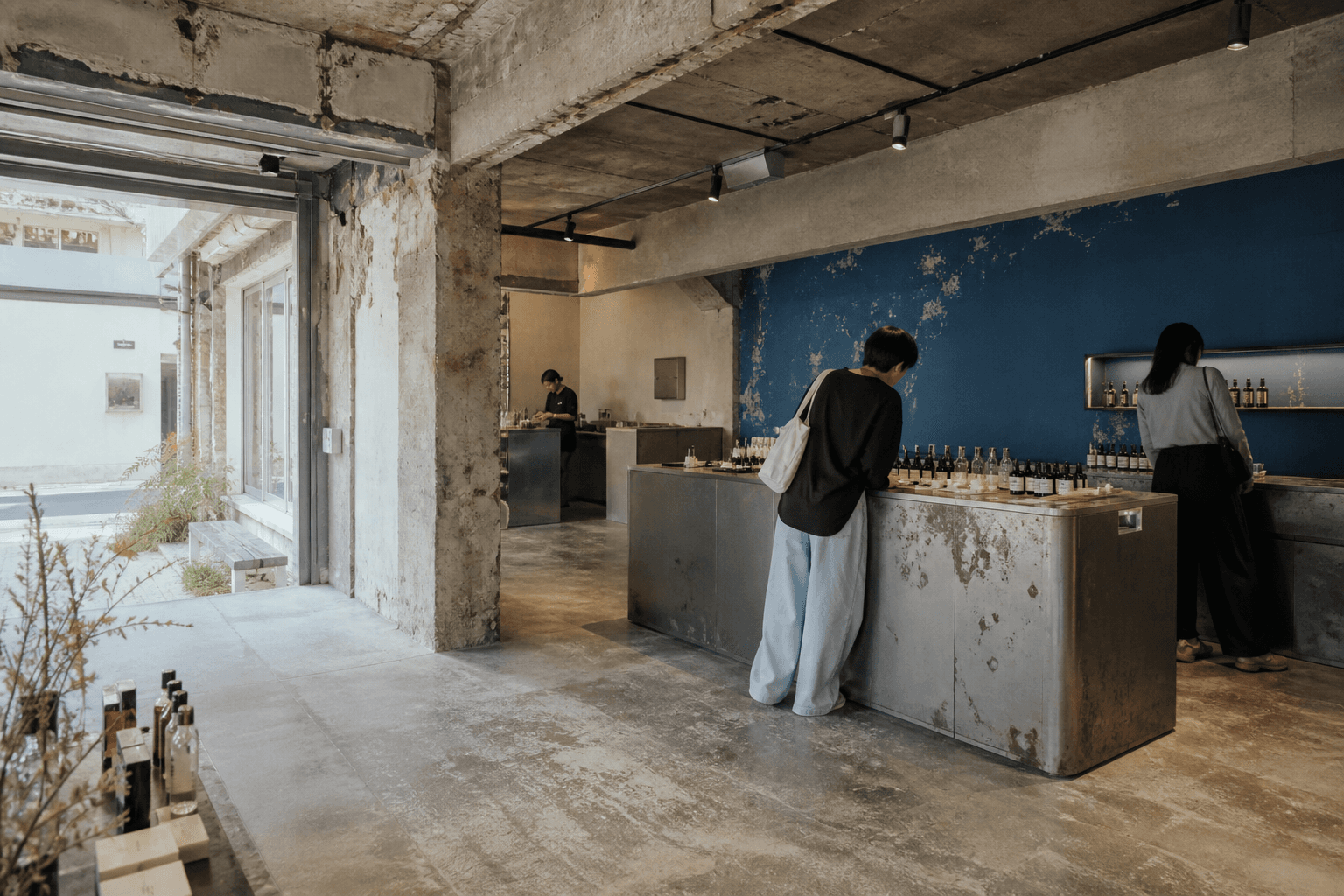
It's not the products. It's the ceiling height, the way the counters are laid out, the fact that nobody has approached you, and the specific decision to leave the concrete alone.
We spend a lot of time in these rooms. Here's what they actually share, and the slightly uncomfortable reason it works.
Quick answer
Five traits: the room comes before the product, one committed gesture instead of five hedged ones, testing without pressure, buildings that remember what they used to be, and warmth underneath the restraint.
And the structural reason: when anyone can make a competitive formula in months, the formula stops being the differentiator. The brand world becomes the product.
1. The room comes first
In most markets a brand builds a product, gets distribution, and eventually opens a store. In Seoul the sequence is frequently reversed — the space is the first serious statement, and the product line lives inside it.
Amore Seongsu is the clearest case. It's a converted auto repair shop holding more than 2,000 products across 30-plus brands, and it is explicitly built as a showroom rather than a store. You can test everything. Nobody expects you to buy. It even has free luggage lockers, which is not a retail decision — it's a hospitality one.
Olive Young N Seongsu does the same thing at chain scale: five floors, each organized around a different way of shopping rather than around more shelves. It's a lab for what the format could be, disguised as a branch.
2. One committed gesture
The second trait is a refusal to hedge.
Amuse made its Seongsu flagship entirely pink — the Pink House — and did not soften it with a neutral floor or a wood accent. It commits fully to one color story, which is exactly why it reads as a brand statement rather than a generic pop-up shell.
Tamburins went the opposite direction with the same conviction: raw concrete, cave-like, rotating art installations, almost hostile to product merchandising. The architecture is as much the draw as the perfume.
fwee picked blue and built its whole first store — nicknamed AGIT — around it.
The pattern is that a Seoul brand picks one thing and goes all the way to the end of it. The rooms that fail are the ones that picked three.
3. Testing without pressure
This is the trait visitors notice most and articulate least.
In a Seoul beauty flagship, you can pick things up, use them, sit with them, and leave. Staff are present and largely leave you alone. There's no counter consultation, no hovering, no gentle escalation toward a purchase.
Nonfiction is designed around it — a pared-back, gallery-like layout with open counters built for unhurried testing rather than grab-and-go. fwee lays out dozens of lip shades for open swatching. TIRTIR built five zones it calls Shade Valley specifically so you can match a cushion foundation shade in person — turning the single hardest thing to buy online into the reason to come in.
That last one is worth pausing on, because it's the smartest version of this. The space exists to solve a problem the internet created.
4. Buildings that remember
Seongsu was a light-industrial district — shoe factories, workshops, repair shops, warehouses — and the neighborhood's whole aesthetic grew from renovating those rather than replacing them.
Onion is a converted factory and is widely credited with starting the café district. Amore Seongsu was a repair shop. Ader Error treats its building as an art installation first and a shop second. LCDC Seoul stacks four floors that each keep a distinct identity instead of blending into one retail surface.
The brick stays. The steel stays. The past of the building is legible, and the brand is a guest in it rather than an owner of it.
5. Warmth underneath the restraint
The trait that separates Seoul from the Scandinavian minimalism it superficially resembles.
Nonfiction's own framing for its scents has been about the feeling of arriving somewhere familiar — a grandmother's house. That's a strange brief for a brand whose store looks like a gallery, and it's exactly the tension that defines the register: visually severe, emotionally soft.
You see it in the small things. Warm light rather than white. Tea rather than water. Somebody offering you a seat. NUDAKE Tea House, on the fifth floor of a Gentle Monster flagship, is a dessert bar built around kinetic art — a genuinely avant-garde space whose actual function is to give you somewhere to sit down and eat cake.
Cold buildings, warm hosting. That's the Seoul combination.
The uncomfortable explanation
Now the part that connects it all.
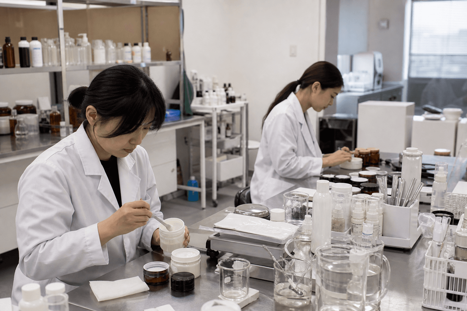
Korean beauty runs on an unusually strong contract-manufacturing layer — Cosmax, Kolmar, Cosmecca and others — which means a small team can develop and ship a competitive formula in months without owning a lab. It's why small companies now drive about 71% of Korea's cosmetics exports.
But it has a second consequence. If the formula is broadly available, the formula cannot be the brand.
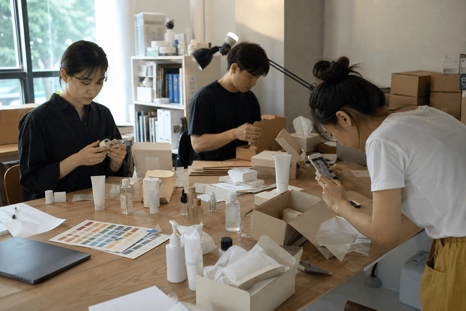
So the brand becomes everything around it. The room, the color, the packaging weight, the way the staff behave, the story about the vinegar brewery or the grandmother's house. In a market where product differentiation is genuinely hard, world-building is the only defensible moat.
That's not cynicism — some of the best design work happening anywhere right now is in these rooms, and it's happening precisely because it has to. But it explains why Seoul beauty brands invest in architecture at a level that would be irrational anywhere else.
Where it tips into template
And here's our actual criticism.
The Seongsu flagship look has become a genre. Concrete, one accent color, sparse product on long counters, a staircase you photograph, a rooftop. Once you've seen ten of them, you've seen the eleventh before you walk in.
A genre is one step from a cliché, and some of these rooms are extraordinary marketing for entirely ordinary products. We've walked out of beautiful spaces holding something we later realized was unremarkable, and the room did that.
Our test, and we'd offer it to you: after you leave, wait forty-eight hours. If you still want the thing, the product earned it. If you don't, the building did.
The brands we rate highest are the ones where both hold up — where the room is the argument and the formula backs it. Which ones those are is a different article, and deliberately so.
Read next
The industry change underneath all of this: why everyone is looking at Korean beauty differently now. Want to actually walk these rooms? Where we'd shop beyond Olive Young and the Seongsu beauty-and-bites route.
FAQ
What makes Korean beauty brand design distinctive?
Five recurring traits: the retail space is developed before or alongside the product, brands commit fully to a single visual gesture rather than hedging, stores are built for pressure-free testing, buildings are adaptively reused with their industrial past left visible, and the overall restraint is paired with warm hospitality.
Why do Korean beauty brands invest so much in stores?
Because contract manufacturing makes competitive formulas broadly accessible, so the product itself is hard to defend as a differentiator. The brand world — space, packaging, story — becomes the durable asset.
Which Seoul beauty flagships are worth visiting?
Amore Seongsu for scale and testing, Tamburins and Nonfiction for fragrance and architecture, TIRTIR for shade matching, Amuse and fwee for full-commitment color worlds, and Olive Young N Seongsu for where retail formats are heading. All are within walking distance of each other.
Is the Seongsu aesthetic getting repetitive?
Increasingly, yes. Exposed concrete, a single accent color, sparse counters, and a photogenic staircase have hardened into a recognizable genre. The rooms still work; the surprise has largely gone.
How do I tell a good brand from a good store?
Wait two days after leaving. If you still want the product, the formulation earned your interest. If the desire faded with the memory of the space, the architecture was doing the work.